Good Cash
Good Cash for good people, an app development project
Client
Good Financial
Team Grayscale
Project Management: Jarijn Nijkamp, K Chan
Branding: Chelsea Ng, David Wieland
UX and UI: Anna Amicci, David Wieland, K Chan
Development and Operations: Aceler Chua, K Chan
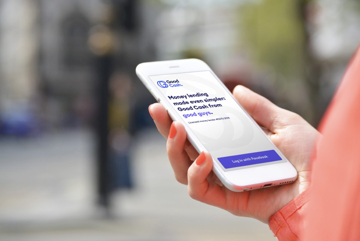
Loan sharks in Hong Kong have been taking advantage of the domestic workers’s financial illiteracy. Good Financial wanted to fix the market by offering ethical loans to these workers, but the team only had an MVP. To truly make an impact, Good Financial approached us with the challenge to create something that can take their business to the next level.
Note
My input in UX/UI of the app is being left out on purpose to drive focus to my effort in project management and development. To see a more design-driven perspective, check out Anna and David’s portfolio.
Project Management
Redefining the brief
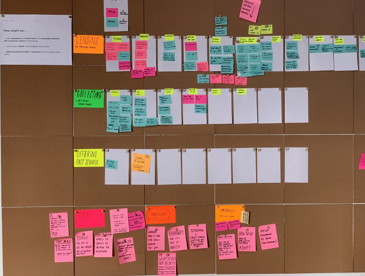
The client team had a clear vision, but lacked specifics. To fix that, we organised a few workshops to crystallise the goals that my design team, development team, and their operations team can all commit. We reviewed their pain points, prioritised needs, and came up with what had to be done:
- Redevelop the Good Cash app so domestic workers in Hong Kong could apply and repay a loan easily;
- Devise workflows to streamline the entire operations; and
- Source or develop necessary tools to facilitate the application review and loan disbursement processes.
Keeping the scope practical
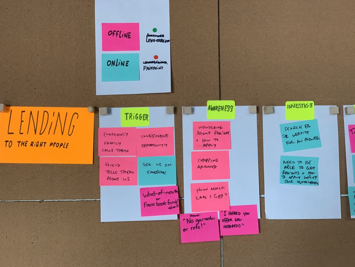
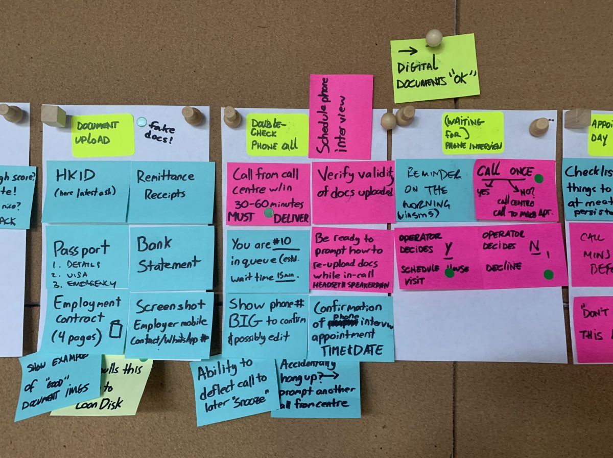
During the discussion, I realised the client was idolising what the app can do, so the next step was to help them understand what was practical. We asked the team what screens they expect to see in the app, and how these screens connect to their operations. The screens were then sketched on paper, and each remark was noted on a separate sheet.
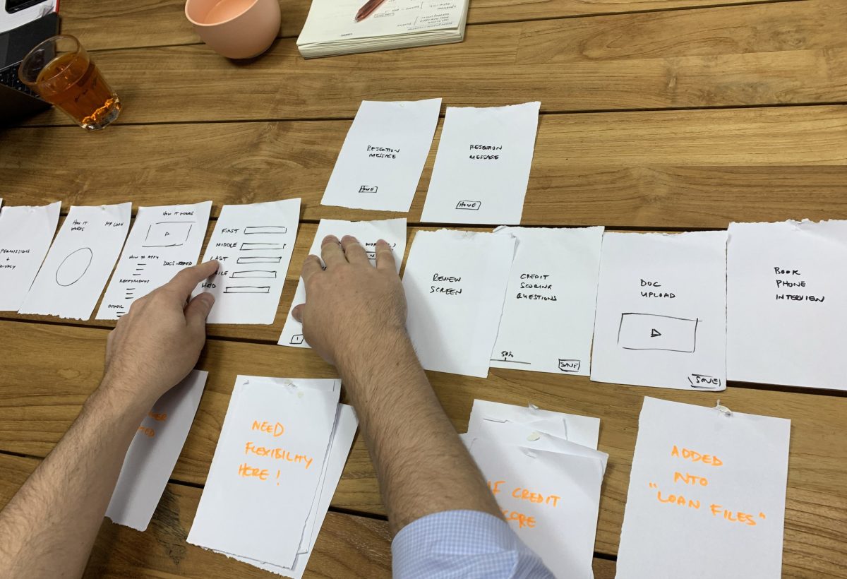
This exercise not only helped visualise specifics in their workflow, but also showed the team how complicated their idea was. The tangible objects made it easier for me to explain the abstract programming effort that could cause deviation from the discussed timeline and budget. It also opened up discussions for alternatives.

A notable win from the exercise was convincing the client to drop the automated credit-scoring system. While the feature could be a game-changer, once the client saw the growing stack of paper with questions, they understood it was not feasible with the allocated resources – not even with the trimmed down digitalised version as shown above.
Why not use a score from a credit agency?
Most domestic workers do not have any credit history in Hong Kong. Their standard 2-year employment contract is seen as a major runaway risk to credit-issuing businesses, so there is no way for them to build a history up (which is why they often resort to the illegal loan sharks).
Managing the day to day
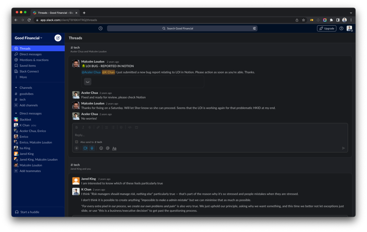
As the client team was fairly small and willing to move quickly, we agreed to run the project in a semi-Agile way, using Trello to keep track of our Sprints. We also created a Slack workspace with them for quick discussions on design or development concerns, while major decisions were made over face-to-face meetings and confirmed over emails.
UX and UI
Design, test, and repeat
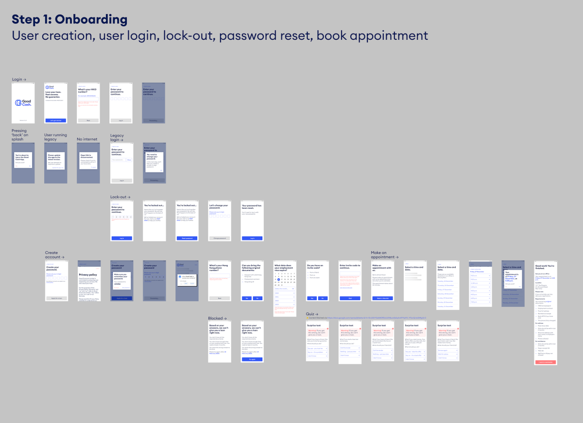
Moving past the planning phase, we reviewed the existing technical infrastructure, and started working on user journey, workflow, and app design. We created prototypes, tested on real users, and made iterations based on user feedback and development constraints.
Development and Operations
Staying in budget
As the project moved along, more resources were rightfully spent on branding and UX than expected. We alerted the team of the situation and convinced the client into parking some ideas for a later phase when they get another round of funding.
Because of the tightened budget, Good Financial can no longer afford building their own system from scratch. To circumvent that, we had to use free, low-cost, or existing SaaS tools, to which I suggested they go with a ‘decentralised’ approach:
- As domestic workers apply for loans in the app, data would be stored in the SaaS tool responsible for that step instead of one centralised database;
- Domestic workers would use the app to send and fetch information through the APIs of each SaaS tool; and
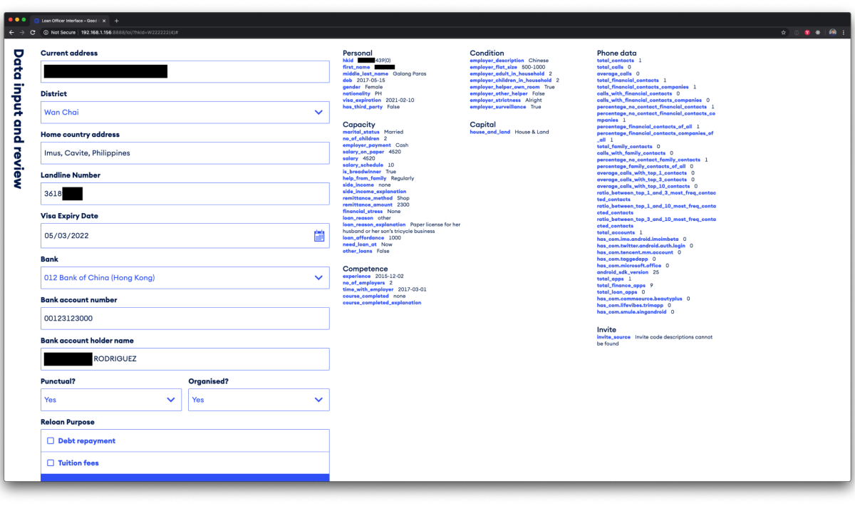
- To avoid the operations team jumping between tools, we would build a dashboard as a single point of access for them to send and fetch data through the APIs of each SaaS tool.
It’s all connected
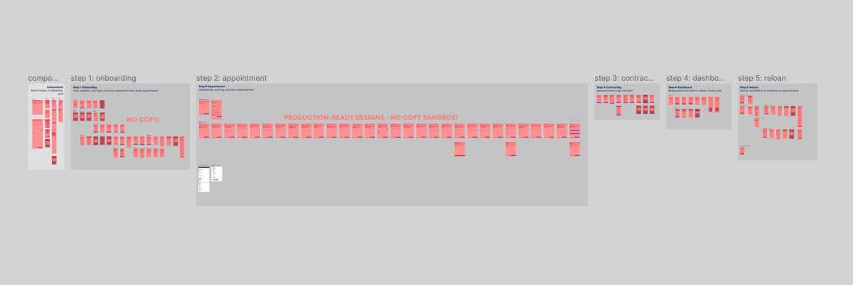
With the direction approved, we sourced different tools, mapped out how data would move from one to another, and delivered the master flowchart with workflows below.
Interfaces Connected
- Good Cash app
The one and only tool domestic workers use to submit and retrieve information regarding their application and loan - Loan Officer Interface (LOI)
A new web-based dashboard created by our team for the client to create, read, and update information in the SaaS / databases
SaaS / Databases Connected
- LoanDisk
A loan management system with incomplete and unreliable APIs the client cannot move away from - Firebase
Temporary storage to bridge the app, the LOI, and the unstable LoanDisk; also houses functions to move data from one service to another - SimplyBook
Low-cost appointment system behind the app
Master Flowchart
The Result
Good progress for Good Cash
After hours of deliberation and countless taps, the Good Cash app and LOI were live. The client was happy with the product and operations efficiency was greatly improved. We were told the amount of loans disbursed had at least tripled with no major increase in default rate.